Building a custom dialog in Flutter
Flutter’s built in Dialog widgets (also known as popup or modal) such as the AlertDialog are pretty nice, but sometimes you want to build something custom to fit in with your app’s look and feel. In this blog post I will show you how!
What we will build
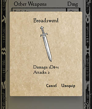
Here’s how my custom dialog looks like (screenshot taken from my RPG app Sound Realms: Mace & Magic). You can see that it differs quite a bit from the standard dialog.
The code
Turns out it isn’t that hard to construct a custom dialog. Here’s a simplified version of the code for a custom dialog widget.
import 'package:flutter/material.dart';

class CustomDialog extends StatelessWidget {
  final String title;
  final String description;
  final List<TextButton> actions; // A list containing the action buttons to show
  final String? imagePath; // Optionally show a static image file

  const CustomDialog(
      {required this.title,
      required this.description,
      required this.actions,
      this.imagePath});

  @override
  Widget build(BuildContext context) {
    return Dialog(
      elevation: 24.0,
      backgroundColor: Colors.transparent, // Remove standard dialog background
      child: Container(
          // Instead fill dialog with our custom dialog background image
          decoration: BoxDecoration(
              borderRadius: BorderRadius.circular(5), // Nicely rounded corners
              image: DecorationImage(
                  image: AssetImage("assets/images/common/popup.png"),
                  fit: BoxFit.none)),
          child: _renderDialogContent(context)),
    );
  }

  // Actual content of dialog. Add styling and padding as needed
  Widget _renderDialogContent(BuildContext context) {
    return Column(
      mainAxisSize: MainAxisSize.min,
      children: [
        Text(this.title), // Dialog title
        imagePath != null // Show image, fallback to just some empty space
            ? _renderImage(imagePath!, context)
            : Container(height: 20),
        Text(this.description), // Dialog body text
        // A row with action buttons:
        Row(
            children: this.actions,
            mainAxisSize: MainAxisSize.max,
            mainAxisAlignment: MainAxisAlignment.end,
        ),
      ],
    );
  }

  Widget _renderImage(String imagePath, BuildContext context) {
    return Container(
        width: 165,
        height: 165,
        margin: EdgeInsets.symmetric(vertical: 0, horizontal: 5),
        decoration: BoxDecoration(
          image: DecorationImage(
              image: AssetImage("assets/images/" + imagePath),
              fit: BoxFit.scaleDown),
        ));
  }
}
Text styling etc is done using my normal theme in main.dart (left out as an excercise to the reader).
Usage
CustomDialog(
  title: "Broadsword",
  imagePath: "assets/images/broadsword.png",
  description: "Damage: 1D8+1\nAttacks: 2",
  actions: [
    TextButton(
      child: const Text('Cancel'),
      onPressed: () {
        Navigator.of(context).pop(); // Close dialog
      },
    ),
    TextButton(
      child: const Text('Unequip'),
      onPressed: () {
        // ... Do stuff ...
        Navigator.of(context).pop(); // Close dialog
      },
    ),
  ],
)
Conclusion
Using Flutter’s powerful and flexible tree-based layout mechanism, it is easy to style any part of the UI. This is useful when aiming for a result that goes away from the native app look-and-feel or Google’s Material UI. And the best thing about it is that we get identical results on both iOS and Android without having to retort to any platform-specific code! My own dialog is pretty simple, with just a custom background and some font styling, but is is not that more difficult to build far more complex layouts with these basic tools.